Sunday, 23 October 2011
Monday, 26 September 2011
Wednesday, 17 August 2011
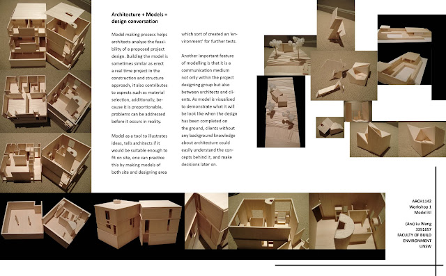
week5: Poster -Model it!
This poster designed to be a comprehensive selection of my models which records the progressive improvement through out the exercise Model it! Plus, some thoughts about how the modeling helps architects in various aspects of their representation.


Labels:
Ara Wang,
ARCH1142,
fisher house,
louis kahn,
modeling
Monday, 15 August 2011
Sunday, 14 August 2011
MM in design presentation- Assignment 1
Catch the Paper (148Kb)
Monday, 1 August 2011
Thursday, 16 June 2011
Tuesday, 14 June 2011
EXP3: file links
Sketchup Model @ Google 3Dwarehouse:
[the bridge
gaga's office/ elevator
Jonathan's office/ elevator
dining table
all include]
Filefront:
EXP3: submission
Textures used in the model

dining table
the loop on the bridge
Johnathan's office
Lady gaga's office
Johnathan's elevator
GaGa's elevator
Real time captures
Lady gaga's office was designed to be an irregular shape initiated from a pentagon twisting to the end of the bridge. The reason for this is that when twisting, the surfaces of the office visually sharpen as it looks like the combination of triangles, just like gaga's way of interpreting herself—a sharp personality. Yet, this like-diamond shape usually associated with feeling such as luminous and sparkling, gaga as a super icon is the insider of high fashion, trends and music industry, a star that is shining for attention. And because of her ‘aggressive’ personality, the bridge stretches from her office to Jonathan’s office.

Jonathan's office is inspired by the shape of circuit board, representing the technology advance. Although Jonathan's design focus on the exterior of the product of Apple®, the design is no longer of the simple visual beauty but as a way to interpret the incredible technical functions of these products, such is the power of technology. Also, compare to the draft model, the way how the office structured with the cliff changed in a significant way, instead of just put the office "on" the flatter cliff surface, it stands up with the pilasters embedded into the cliff as bases and supports. This sticky way of connection make the office fitter with the cliff and shows out how technology can help with constructions as well.
Dining table is streamline shaped, the seat and table are connected together as an entire structure, and the table is also believed to reflect the shape of a natural tree trunk, which was inspired by gaga’s belief in natural beauty, explained in her new album “Born This Way”, the company Apple®, in the similar fashion, chose “apple” as the name and logo of their business. The streamline shape indicates Jonathan’s design of products of Apple®, and the fashion market that gaga is leading. The whole project of dining table pursues the beauty of nature.
Ive’s elevator follows the rule of conciseness and mechanism, there are some details inside the elevator on the wall that allows the company to put on their new design for display, and the soft edges further illustrate Jonathan’s style of design. Moreover, the elevator is part Jonathan’s office, it separates from the building while it is functioned, again, about the mechanism and technology.
GaGa’s ‘rose’ elevator painted in red to show off even in the night time and capture attentions. This fancy appearance was inspired by the structure of rose, the middle been protected, like gaga the queen kind of fashion star has always been followed, therefore needs to be protected. The stairs of the elevator is worse mention that it was formed with several petals of the rose, like gaga’s unique style of acting. The elevator lands in a distinctive way as it lands on the bridge loop. All the design of lady gaga’s projects lying on the principle of natural ways of performance for human beings, in the other words, the power of natural.
Subscribe to:
Comments (Atom)


